Tuesday, 23 August 2016

Final Posters + Rationales


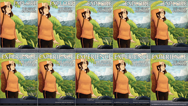
For my posters, I played off the “Clean Green New Zealand” image and various tourist imagery to highlight our homelessness problem and attitude towards it. The headline is “Experience/Explore the Great Outdoors”, riffing off tourism advertisements and creating a strong wehi when paired with the image of homelessness.
For my first poster, the main poster is large, warm, and saturated, with large paintbrush strokes giving a happy energetic feeling to fit the headline. In juxtaposition to this, there is a homeless person sleeping below on the pavement, shown in dull, cold tones and a grittier texture. They are also much smaller than the person on the poster with their head positioned under the larger hand, showing them as weaker and more vulnerable.
For my second poster, I went with the lineless style and muted, natural colours used in many old New Zealand posters. The homeless person sitting in the corner is dressed in dark browns and dull tones, in comparison to the lighter greens and blues of the nature behind them.
Both posters work with juxtaposition, moving the eye from the produced ads and headline to the reality and caption, changing the wehi from happiness and nostalgia to an unpleasant realization.


Week 6 Feedback

I showed my two designs in class today and got some final feedback before sending off to print.


On my first poster, I brightened up the colours a lot (printing was really washing them out) and changed some of the hues to make them stand out more, particularly for the mountains. I also fixed the kerning on the headers.


On my second poster, I changed the type around some more to make it visible and eye catching. I also added a little bowl next to the person to draw the eye.


After a few more text prints, I collected my files and sent them off to the printer!

Sunday, 21 August 2016

Week 6 Monday

These are my final designs for now. I plan to get some more feedback tomorrow in class, tighten them up, then send them off to print so I can pick them up on Tuesday and be ready for hand in.


Poster Development


Poster 2 Illustration Updates

I've been making small tweaks to this illustration as I've worked, mostly fixing up tone/values and contrast to stop certain elements getting lost, while still keeping the colour scheme mostly unchanged. I also changed the texture shapes on the mountains to make them more in line with the style of the rest of the image.

Before (left) and after (right):


Friday, 19 August 2016

Poster 1 Illustration Update


Based on Caroline's advice, I repainted the colours on this illustration to be more vibrant and also added more texture to make it feel happier and more modern.

Artist Inspiration - Fraser Williamson


Fraser Williamson is a well known New Zealand illustrator whose work has been featured in school journals, tv ads, and other mediums. I like the use of colour and texture in his work.